|
There are still some occupations that refer to 'colour temperature' as a means to describe or relate colours to physical attributes, some examples include astronomy, metallurgy, and film
photographic's each of those disciplines have their own perspectives about how specific colours may have a tangible thermal reference. The problem is that from a colour science point of view colours do not have a uniform connection to a specific temperature, for example in some circumstances a blue colour may signify a relatively cool thermal reference in other circumstances it may indicate a relatively hot thermal reference.
Lets examine a few of examples below in relation to the colour blue;
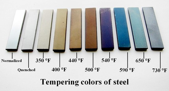
Metallurgy - If steel is cleaned and polished and then permitted to form an oxide layer on its surface before being heated for the purpose of tempering (hardening) the steel, when the steel is heated to around 310°C the oxide will appear to be dark blue in colour, if the steel is heated by a further 30 degrees it will appear light blue in colour1. From a metallurgists point of view blue steel tempering would be considered towards the mid to upper end of the thermal tempering range.

Attribution
Astronomy - A large blue star is sometimes referred to as a blue giant (or a spectral class O, B or A), a blue star is a large star that has begun to exhaust its fuel core and expand in size and becomes extremely bright and very hot, for example Rigel the brightest star in the constellation of Orion is roughly twenty times the size of our Sun and it emits more than 60,000 times as much light as our sun2; Rigel is very bright, very hot and it is emitting beautiful blue light.

Glaciology - Glacial ice may tend to have a blue hue for the same reasons that the ocean can appear blue or green, it is simply due to red and yellow portions of the light spectrum being absorbed or passing through the ice or water, at the same time some of the light is reflected back and if less of the yellow or red spectrum is reflected back and more of the blue spectrum then the ice or water appears to be blue. We discussed the in our previous article
Why Do Cosmetic Tattoos Change Colour - Part 2 how the differences between long and short wavelength light reflectance in a colloid was first described by the physicist John Tyndall during the late 1800's and became known as the Tyndall effect, we adopted the term the Depth: Colour/Size effect to describe how the spectral characteristics of human skin can also affect the apparent size and colour of implanted pigment, and as outlined previously this has nothing to do with the colour being warm or cool.
Whilst we often associate blue ice with being very cold a glaciologist might associate it with the thickness, suspended particulates, or compaction of the ice rather than its temperature.

You can see from the above that although different professions might use colours as indicators of physical attributes, from a colour science perspective colours do not have a constant relationship to thermal temperature it changes depending on the circumstances, properties of the underlying material, its spectral characteristics and the way in which the object is viewed/observed.
Question: Cosmetic tattooists often refer to skin colours and tattoo pigments as being warm or cool but where exactly did this terminology come from?
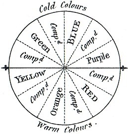
Answer: Our origin of warm and cool colours comes from the art world and the first published reference that we were able to find was by the English artist Charles Hayter within in his publication an Introduction to Perspective (1813)3, below is the original colour wheel that Hayter created.

Attribution
Over the years paint artists have continued to use Hayter's colour wheel (or variations of it) in an attempt to help them work with colours on the canvas. When I completed my own art diploma my lecturers would frequently refer to the colour wheel as well as warm or cool colours, and although some artists sometimes differ on the exact pivot points by and large the concept of warm or cool colour has stayed true to Hayter's original colour wheel.
For an artist the terms warm and cool have two main purposes in relation to colour;
- It offers a tangible relationship to thermal or perceptual temperature within our natural world, for example;
Cool - Oceans (blue, green), Overcast skies (grey), Glaciers (blue), Cold skin (blue, purple).
Warm - The sun/sunset (yellow, orange), Fire (yellow, red, orange), Warm Skin (pink, red).
- Adjusting/Mixing Colours
Artists sometimes describe a complementary colour on the colour wheel as tending to neutralise its complement on the opposite side of the colour wheel4, meaning that when you mix complementary colours the mixed colour will trend more towards a muddy often brownish hue.
Cosmetic tattoo technicians and trainers sometimes confuse the word complementary (to make complete) with complimentary (flattering, looks good together), complementary colours together with their complement on the opposite side of the wheel will contain all three primaries of the paint artists triad (Red, Yellow, Blue). For example purple contains Red and Blue its complementary colour is yellow so together they complement (complete) the triad by containing all three of the paint artists colour model primaries of Red, Yellow and Blue.
Important Concept: A Complementary colour is one that 'completes' the triad, not one that necessarily compliments the other colour.
Colour Space
Colour Space is the term used to describe how a colour model represented by numbers using a mathematical formula or via colour components (e.g. Red, Yellow, Blue) can be mapped to a gamut, a gamut is the broadest range of colour variations that can be achieved by mixing each of the colour components (primaries and their mixes) in every combination possible. You can think of a gamut as being a colour models footprint, if you had 3 primary colours and mixed them together in every possible combination and partial combinations and painted the colour mixtures on a very large piece of paper that would be the gamut for that colour models primaries .
The three Colour Models that you are most likely to be familiar with are;
• RYB (Red, Yellow, Blue)
• RGB (Red, Green, Blue)
• CMYB (Cyan, Magenta, Yellow, Key [black])
Colour Model: RYB (Red, Yellow, Blue)

The RYB colour model that many paint artists still use has its detractors, mainly this is because of some of the past theories/claims surrounding the RYB colour model are now known to be untrue, for example;
Outdated Claim: You can make all other colours from the primaries RYB
Fact: Actually you can only make a limited range of other colours from the primaries Red, Yellow, Blue.
Each colour model with its specific primary colours has its own unique gamut (the range of other colours that can be created by mixing the primaries together in varying combinations) RYB has a smaller gamut of colours than can be perceived by the human eye so the colour model is limited when compared to our colour perception and because you cannot mix all possible colours with those three primaries some claim that from a colour science perspective that makes it a flawed colour model.
On the positive side many paint artists say that they find the RYB colour model very simple and intuitive and therefore it is adequate for their needs4, in other words they quickly develop (or some claim they always had) an innate understanding of the colour result from mixing the primaries together in varying combinations and partial combinations.
There may actually be some merit to the idea that human beings have an innate relationship with certain colours, for example a study conducted by researchers at the University of Rochester5 found that when human beings see the colour red, their physical reactions become faster and more forceful, and most are completely unaware of the intensifying effect that the colour red has on them. It is quite likely that an innate relationship with colour developed within our primitive ancestors to enhance our chances of survival, to identify sources of food, or to avoid predators or dangerous circumstances (e.g. perhaps a direct stimulus for the fight or flight response).
The RYB colour model has;
3 Primary Colours: Red, Yellow, Blue
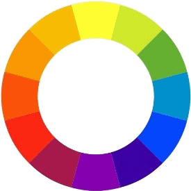
3 Secondary Colours: Orange, Purple (Violet), Green (secondaries are created by mixing 2 primary colours together in equal proportions)
6 Tertiary Colours: Red-Orange, Yellow-Orange, Yellow-Green, Blue-Green, Blue-Violet, Red-Violet (tertiaries are created by mixing 1 primary and 1 secondary colour together or two secondary colours in equal proportions).
Just to add confusion the RYB tertiary colours do not have fixed names so you may see the tertiary colour Blue-Purple referred to as violet as well as the secondary colour purple being referred to as violet as well.
Colour Model: Cyan, Magenta, Yellow, Key Black (CMYK)
A more contemporary colour model is (CMYK) this colour model is widely used by the printing industry because it has a larger gamut (bigger colour map/footprint) than the Red, Yellow, Blue colour model, you will notice that your colour printer probably contains ink/toner cartridges with the (CMYK) primaries.
Some people argue that the (RYB) colour model should no longer be used because the model is flawed from a colour science perspective, however (CMYK) cannot produce all of the colours that the human eye can perceive either as is often discovered by the manufacturers of portrait artists paints when they unsuccessfully attempt to reproduce swatches for their paint ranges with a CMYK model.
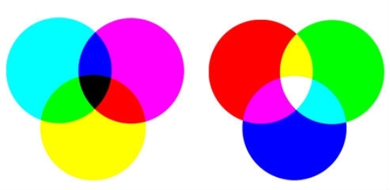
Where CMYK really comes into its own is when working with colour moving between an additive and subtractive colour space, for example LCD computer and television screens use the Red Green and Blue (RGB) light emitting diodes to represent colours with the addition of Red, Green or Blue coloured light which maps nicely to the reverse CMY/K subtractive colour model when printing the image that you seen on your computer screen onto paper with your colour printer.
| Subtractive: CMY/K |
Additive: RGB |
 |
Additive vs Subtractive Colour Models
The simplest explanation of the difference between additive or subtractive colour models is an LCD computer screen creates colour images by adding light from Red, Green or Blue light emitting diodes, where as a physical object subtracts portions (wavelengths) of the colour spectrum within white light shone onto the object and reflects other portions back towards the observer, the wavelengths being absorbed or passing through (subtracted) affects the apparent colour that is reflected back from the object.
There are several more scientific colour models such as CIELAB, Munsell, CIEXYZ which have a gamut closer to the colour perception of the human eye but they require more complex mathematical calculations to work with in comparison to the simpler colour models.
Most cosmetic tattooists continue to use the RYB colour model because it is simple and many consider it to be intuitive, regardless of what colour model we choose to use we rarely ever work with primary colours we are nearly always working with mixtures of secondary or tertiary colours both in relation to pigment and skin colours, if the RYB colour model helps you to conceptualise your work then it is a useful model provided that you are aware of its limitations.
Perceptual Variations
Depending on the study being quoted and the type of colour vision deficiency around 8% of men and around 0.4% of women may have a colour vision deficit6, even within the range of what is considered normal colour vision people may have differences in their perceptions of colour particularly with differentiation between closely related hues. If you have never had your colour vision tested then it is a worthwhile exercise particularly if you find that you struggle with colour discrimination or have difficulty working with colours.
Warm vs Cool
In addition to the RYB colour model warm vs cool is the other colour concept that is most often referred to by cosmetic tattoo pigment manufacturers, trainers, and technicians; as discussed previously in relation to colour warm and cool are not on solid ground from a colour science perspective they are primarily an abstract concept that was proposed over 200 years ago to help paint artists to conceptualise colour particularly in relation to mixing complementary colours. The question is does use of the terms 'warm' and 'cool' help cosmetic tattooists to conceptualise colour during their work or does it simply confuse technicians more than it helps them?
Some cosmetic tattoo trainers, pigment manufacturers and technicians seem to be publishing information about warm vs cool pigment/skin colours that is fairly close to the original colour wheel proposed by Charles Hayter others seem to have radically different perspectives about warm vs cool colours that bears no relationship to Hayter's colour wheel or even a tangible connection to an obvious physical/thermal reference. Its likely that some of the more abstract ideas about warm vs cool colours emanated from the fashion industry where autumn colours of leaves are sometimes described as cool colours and also perhaps from individuals simply inventing their own warm and cool colour concepts based upon personal perceptions.
We contend that the designation of warm or cool to skin and pigment colours only has value if;
1) It assists technicians to predict the likely outcome from mixing different coloured pigments.
2) It assists technicians to predict the likely healed outcome from using different coloured pigments in combinations with various skin colours.
&
3) Pigment Manufacturers, Cosmetic Tattoo Trainers and Technicians are all using the same system to designate warm vs cool colours.
With the above in mind thought it would be interesting to see if industry members agree about the abstract concepts of warm vs. cool colours so a questionnaire was created where technicians were asked to determine if a colour was warm or cool from a set of 33 colours. Standardised hex colour codes where chosen as we felt they had the greatest chance of uniform representation (within reasonable tolerance) across the broad range of visual display devices that may be used to view the questionnaire. Whilst we acknowledge that there may be hue variations on different devices each of standard hex codes was carefully chosen. Much like cosmetic tattoo pigment colours standard hex colour code names are arbitrary and do not necessarily provide a clear indication of the actual colour, for this reason we deliberately choose some colours based on their name in an attempt to see if the name of a colour would influence the perception of it being warm or cool
Industry members were invited to complete the questionnaire and respondents were simply asked to decide if a colour was warm, cool or neutral, in addition to the warm
vs. cool determination additional information was logged such as the time frame spent on the questionnaire in an effort to capture uncertainty on the part of the respondent.

Results of the Questionnaire
Perhaps the most surprising result that we obtained was the sheer number of technicians who failed to provide a warm/cool determination for every colour (n131/176) and the length of deliberation that was involved over certain colours.
Below I have indicated which colour required the longest average time for
deliberation and which colour required the shortest average time for
deliberation, the colours marked with a * red asterisk are those that we felt respondents may have been most influenced by the name of the colour.
| No. |
Colour Name |
Warm |
Cool |
Neutral |
Undecided |
Comment |
| 1) |
Navy |
3.3% |
69.9% |
16.6% |
10.2% |
|
| 2) |
Medium Blue |
0.0% |
92.6% |
7.4% |
0.0% |
Second shortest period of deliberation |
| 3) |
Light Sky Blue |
6.4% |
71.3% |
12.9% |
9.4% |
|
| 4) |
Medium Turquoise |
11.6% |
58.1% |
11.7% |
18.6% |
|
| 5) |
Medium Sea Green |
20.55% |
41.1% |
20.55% |
17.8% |
|
| 6) |
Green |
23.8% |
41.6% |
17.8% |
16.7% |
Second longest period of deliberation |
| 7) |
Lime |
20.1% |
63.6% |
10.0% |
6.3% |
|
| 8) |
Green Yellow |
30.9% |
58.4% |
6.9% |
3.8% |
|
| 9) |
Khaki |
15.6% |
18.8% |
53.5% |
12.1% |
|
| 10) |
Dark Golden Rod |
42.3% |
26.1% |
22.7% |
8.9% |
* |
| 11) |
Brick |
76.3% |
3.5% |
17.3% |
2.9% |
|
| 12) |
Chocolate |
77.3% |
6.7% |
10.1% |
5.9% |
* |
| 13) |
Peru |
62.5% |
3.5% |
31.2% |
2.8% |
|
| 14) |
Sandy Brown |
53.2% |
6.2% |
28.2% |
12.4% |
|
| 15) |
Dark Orange |
91.4% |
7.0% |
0.0% |
1.6% |
|
| 16) |
Cadmium Yellow |
83.3% |
0.0% |
13.9% |
2.8% |
|
| 17) |
Gold |
82.9% |
6.6% |
3.3% |
7.2% |
|
| 18) |
Yellow 1 |
65.8% |
13.2% |
13.2% |
7.8% |
|
| 19) |
Orangered 1 |
90.4% |
0.0% |
6.9% |
2.7% |
Shortest period of deliberation |
| 20) |
Red |
63.2% |
15.8% |
9.5% |
11.5% |
|
| 21) |
Firebrick 4 |
60.7% |
25.0% |
14.3% |
0.0% |
* |
| 22) |
Brown |
58.4% |
16.3% |
16.2% |
9.1% |
|
| 23) |
Maroon |
49.0% |
24.5% |
12.3% |
14.2% |
|
| 24) |
Crimson |
44.4% |
34.9% |
9.5% |
11.2% |
Longest period of deliberation |
| 25) |
Violate Red |
29.2% |
48.7% |
9.7% |
12.4% |
|
| 26) |
Deep Pink |
29.1% |
55.1% |
6.5% |
9.3% |
|
| 27) |
Hot Pink |
34.6% |
58.8% |
3.5% |
3.1% |
|
| 28) |
Maroon 1 |
24.7% |
67.2% |
3.5% |
4.6% |
|
| 29) |
Orchid |
20.8% |
76.4% |
0.0% |
2.8% |
|
| 30) |
Blue Violet |
0.0% |
83.0% |
9.9% |
7.1% |
|
| 31) |
Thistle |
12.4% |
58.7% |
15.7% |
13.2% |
|
| 32) |
Black |
0.0% |
28.2% |
59.8% |
12.0% |
|
| 33) |
White |
3.4% |
13.7% |
78.6% |
4.3% |
|
Overall there were not high levels of census, some individual colours such as Orangered 1 and Medium Blue did have a high degree of consensus but inexplicably other colours such as Medium Sea Green had low levels of consensus where perhaps it might have been expected and the majority opinion about some colours were inconsistent with what would be taught in mainstream art classes relating to the concept of warm
vs. cool colours.
Some cosmetic tattooists may feel that designating the terms warm or cool to skin colours or pigment colours assists them to conceptualise colour or to help them predict possible outcomes from their cosmetic tattooing, but clearly many cosmetic tattooists are confused by the use of those terms (perhaps those without any formal art education or those who have been provided conflicting information). Warm or Cool labels are not colour science they are arbitrary labels proposed by an artist 200 years ago to help art students with their work, the concept is abstract and the labels could just as easily be reversed. If technicians differ so much in their interpretation then the value as a conceptual tool within training programs and within pigment literature is dubious.
If the purpose of using the arbitrary terms warm or cool by a cosmetic tattooist is an attempt to simplify their understanding of the possible outcomes from implanting coloured pigments into the skin, then perhaps we need to dispense with concepts that have been coopted from other disciplines which are inclined to confuse technicians and instead incorporate simplified colour concepts that have a more direct application to our work particularly those which will provide a uniform approach.
The Next Part of Our Colour Science Series
What Influences the Colour of a Cosmetic Tattoo?
References
- Michael Bauccio. ASM Metals Reference Book, 3rd Edition. 1993
- Dr Nick Lom. The 2014 Australasian sky guide. Powerhouse Publishing. 2014
- Charles Hayter. An Introduction to Perspective. 1813
- Betty Edwards. A course in the Art of Mixing Colors. Penguin Group 2004
- By Elliot, Andrew J.; Aarts, Henk. Perception of the color red enhances the force and velocity of motor output. Emotion, Vol 11(2), Apr 2011, 445-449.
- Birch J1.Worldwide prevalence of red-green color deficiency. J Opt Soc Am A Opt Image Sci Vis. 2012 Mar 1;29(3):313-20.
Image Attribution
- Tempering standards used in blacksmithing by Zaereth - Own work. Licensed under CC0 via Wikimedia Commons
- Colour Wheel by Charles Hayter. An Introduction to Perspective. 1813
Date of most recent revision: 19/03/2015 (mutatis mutandis)
Original publication date:
18/03/2015
Copyright © 2015
CTshop.com.au & the article author All Rights Reserved. No copying, transmission or reproduction of site content is permitted without our prior written consent.
Disclaimer: The content of this article should be regarded as general information & is provided solely for the purpose of discussion & is not intended to replace cosmetic tattoo training or medical advice in any instance, always check with a cosmetic tattoo master trainer and or a qualified medical practitioner before acting on any information regarding cosmetic tattooing or in relation to any medical condition or medical circumstance.
Printing Restriction: This article is print disabled, please read our Intellectual Property & Copyright Policies if you would like to request a copy or permission to use the article content for any purpose.

|
