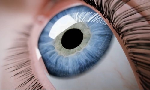
Introduction to the Fundamentals of Colour Perception

16/02/2013
by Andrea Darby - Master Medical Tattooist & Industry Educator
Eye Anatomy

Colour is a complex topic with many variables, it is also an important topic for Cosmetic Tattooists and this series of articles will attempt to demystify the subject and will focus on content that will assist technicians to achieve better outcomes.

▼ Continue Reading ▼

Colour is a complex topic with many variables, it is a subject that is important to Cosmetic Tattooists and yet at the same time even among experienced tattooists many struggle to come to terms with the fundamentals of colour.


By gaining a deeper understanding of the factors that will affect the colour of a cosmetic tattoo the tattooist can improve the outcomes for their clients and reduce the number of unwanted colour outcomes.


The factors that affect the final healed colour of a cosmetic tattoo are quite unique and this series of articles will focus on some key principles that are useful for the tattooist know. We will avoid diverging into areas of colour theory that have little or no direct relevance as can often occur with Cosmetic Tattoo colour courses and lectures.


What is Colour?


Colour is a sensory perceptual experience that occurs when different portions of the ‘visible’ light spectrum interact with the retina at the back of the eye. There are around 6-7 million microscopic colour sensitive receptors called cones on the retina that are most concentrated in the fovea centralis in the middle of the macula. Having an adequate number of normal functioning cones, a healthy macula, and normal transmission of light through the lens of the eye are all essential for us to be able to perceive and experience colour.


Conditions which may cause opaqueness of the lens of the eye (e.g. cataracts) and conditions that may cause degeneration of the Macula (e.g. diabetes or hypertension) can cause significant loss of colour perception as well as general deterioration in the sight.


The sensory input from our eyes is transmitted to the visual cortex located in the occipital lobe of the brain at the back of the head. Apart from the external factors that affect colour, the way in which we experience colour is also affected by both our sensory perception and our neural interpretation of the sensory input.


Even if our sensory equipment (our eyes) are healthy and functioning within normal parameters, each of us will perceive and interpret colour a little differently, partly because we each have different numbers of sensory cones with different levels of sensitivity and partly because our brains interpret the sensory information differently.


In 1965 ‘additive colour’ experimental research revealed that three different types of colour sensitive cones within the eye provided us with sensory perception of different wavelengths of light that broadly correspond with Blue, Green and Red, often referred to as the Tristimulus Values. The diagram below illustrates the average peaks in sensitivity to different light wavelengths for the human eye in normal lighting and in lower lighting.


Tristimulus Sensitivity
The sensitivity scale of 1-10 is arbitrary and is provided purely for illustration purposes.


The grey curve on the right of the graph shows the eye's sensitivity in normal ambient lighting conditions which that is called the 'Photopic Response'. With good ambient lighting the eyes cone colour receptors are at peak sensitivity at about 555 nanometres, which means that under normal lighting conditions, the eye is most sensitive to a yellowish-green colour.


When ambient light levels are very low the response of the eye changes significantly as shown by black curve on the left of the graph, which is called the 'Scotopic Response'.  In low levels of light, the cones in the eyes become less receptive and therefore there is less perception of colour and the sensitivity peak shifts towards the blue/green part of the spectrum.


Key Points 

  • The perception of colour is an individual experience and even among those with normal colour vision there will be perceptual variations from person to person.

  • In normal lighting conditions the eye is more sensitive to greenish yellow colours.

  • As ambient lighting reduces our colour perception diminishes and alters.

  • Clients skin tones and pigment colour selection should always be made in good lighting conditions preferably with natural ambient light.


More Colour Articles


Date of most recent revision: 16/02/2013 (mutatis mutandis)
Original publication date: 16/02/2013

Copyright © 2013 CTshop.com.au & the article author All Rights Reserved. No copying, transmission or reproduction of site content is permitted without our prior written consent.


Disclaimer:
The content of this article should be regarded as general information & is provided solely for the purpose of discussion & is not intended to replace cosmetic tattoo training or medical advice in any instance, always check with a cosmetic tattoo master trainer and or a qualified medical practitioner before acting on any information regarding cosmetic tattooing or in relation to any medical condition or medical circumstance.

Printing Restriction: This article is print disabled, please read our Intellectual Property & Copyright Policies if you would like to request a copy or permission to use the article content for any purpose.

No Plagiarising


Main Menu