|
Lets recap the major factors that actually do influence the final healed colour of a cosmetic tattoo;
Skin Colour
Below I have deliberately used the terms 'outer skin tones' and 'under skin tones' because they are descriptive of the relationship between the location of the tattoo pigment (in the dermis) and any colour influences within the dermis and the epidermis above and below the tattoo pigment, keep in mind that these are provided as descriptive terms not anatomical definitions.
- The clients skin undertone - The undertone is affected by vascular supply, with oxygenated blood providing bright red through to maroon colours and deoxygenated blood providing blue through to maroon colours. Blood vessel walls can range between red, maroon and turquoise. Fat cells and connective tissue can add yellow or white hues. The name melanin comes from the ancient Greek melanos meaning dark, melanin can sometimes be found within the dermis and can appear; yellow, reddish, brown, black, and even blue or grey depending on how deep the melanin is within the dermis.
The clients under-tone can add colour to the final healed colour of the tattoo from beneath, surrounding, and above the tattoo pigment, the higher the saturation of tattoo pigment is within the skin the less influence the skin undertones will have on the healed colour of the tattoo. Over time if the tattoo pigment begins to fade due to break down by the immune system or due to sloughing then the skin undertones will again begin to have more colour influence.
-
The clients outer skin tone - the epidermis may range in colour from white through to yellowish. Melanin within keratinocyte cells in the epidermis can also add yellow, reddish, brown, and black hues to the skin.
The clients outer-tone will add colour to the final healed colour of the tattoo from above the tattoo pigment, high levels of melanin in the upper part of the dermis and the epidermis can have a dramatic effect on the final healed colour of the tattoo and may even obscure the tattoo pigment completely. You can see from the illustration below that whilst cosmetic tattooist frequently talk about the clients undertones it is strong colour influences in the skin above the tattoo pigment which will have the most profound effect on the final healed colour of the tattoo.

- Pigment Fixation - As the bodies immune cells surround and fixate the tattoo pigment and once the healing process is completed the final healed tattoo colour will tend to be slightly altered. This occurs even without the influence of any under-tones and outer-tones, this is because of the wrapping of specialised cells around the pigment reducing light reflection back from the tattoo pigment and increasing the scattering of light within the skin. You could liken this to how an object appears to change colour under water or if you wrapped an object in several layers of cling film.
As the pigment becomes fixated within the skin it will go though changes in appearance, initially the colour may look too bold because there is excess pigment in the epidermis that will be lost during the keratinisation cycle and also because initially the pigment in the dermis has not yet been surrounded by the immune system cells.
Within a few hours to a few days the pigment may be obscured or look patchy due to tissue swelling and clusters of immune cells surrounding the pigment attempting to break it down. By day 10-14 the pigment colour should begin to bloom back as swelling disappears and the concentration of immune cells around the pigment reduce in number and begin to be replaced by longer term fixating structures.
Within 28-42 days after tattooing the final healed tattoo colour will be evident inclusive of the natural skin colour influences mentioned above.
Fitzpatrick’s Skin Phototypes
The late Thomas B. Fitzpatrick (19/12/1919 - 16/08/2003) a world renowned Dermatologist was the founding Author of Fitzpatrick’s Colour Atlas and Synopsis of Clinical Dermatology, he is credited with many significant achievements in the advancement of the field of Dermatology; the melanosome and tyrosinase, the epidermal melanin unit, skin phototypes, melanoma, PUVA photochemotherapy, sun protection factors, vitiligo, and many others.
Outside of the medical fraternity Dr. Fitzpatrick is probably best known for his Fitzpatrick Skin Type Classification Scale which provides an objective assessment of the human skin; its colour (melanin) saturation, genetic predisposition, and skin reactions to ultraviolet light. Your clients Fitzpatrick Skin Type provides an indication of their possible reaction to sun exposure, predisposition towards skin cancers and it also provides an indication of the extent that their natural skin colour may influence the final colour of your cosmetic tattooing.
| Fitzpatrick’s Skin Phototypes |
| Phototype |
Score |
Your Sunburn & Tanning History |
Skin
Phototype Example |
| I |
0-6 |
Burn easily, never tan |
|
| II |
7-13 |
Burn easily, tan minimally with difficulty |
|
| III |
14-20 |
Burn moderately, tan moderately and uniformly |
|
| IV |
21-27 |
Burn minimally, tan moderately and easily |
|
| V |
28-34 |
Rarely burn, tan profusely |
|
| VI |
35+ |
Never burn, tan profusely |
|
You can determine your Fitzpatrick Skin
Type and Phototype by completing the questionnaire on our
Fitzpatrick Skin Type interactive page.
It is not uncommon for pigment manufacturers and cosmetic tattoo trainers to quote Fitzpatrick skin types within product literature and training programs but it is important to be aware of the limitations of Fitzpatrick skin types (in terms of its influence on the final healed colour results after cosmetic tattooing) because sometimes there is an overemphasis placed upon the FST value in assisting with pigment colour selection.
Fitzpatrick skin type provides a cosmetic tattooist 2 pieces of information that
relate to our work;
- An objective assessment of melanin saturation (how much melanin is in the skin, higher levels of melanin will have a more profound effect on the final healed colour of a tattoo).
- An indication of which skin types are more likely to have a predisposition towards hyperreactive melanocytes (particularly Types IV - VI) which might result in hyper-pigmentary complications post tattooing.
I stress again that it is important to keep in mind that a Fitzpatrick skin type is a guide towards melanin saturation it is not actually an assessment of skin hue, as mentioned previously melanin can add yellow, reddish, brown, black, and even blue or grey hues to the skin and sometimes brown hues may even have a blue-greenish tinge. For this reason part of your assessment of the clients skin colour should also include establishing what the dominant hue is because it will assist you in achieving more predictable outcomes. If you are having difficulty deciding what the dominant skin hue is for your client then a comparison to white (e.g. a sheet of white paper) or a comparison to the primary and secondary colours can sometimes help you decide which colour is most dominant in their skin.
Pigment Colour
Most often cosmetic tattoo pigments are combinations of 2-3 or more colourant additives sourced from dry powders, when mixed together in a suspension the final colour is a composite of the various ingredients, some colourant ingredients may tend to fade faster than others with exposure to UV light this is often referred to as their lightfastness, also sometimes a persons immune system may be more successful at breaking down and transporting one or more of the colourant ingredients as compared to the other ingredients. If either of these situations occur then the tattoo may change colour as it fades, in the absence of those factors the pigment will tend to fade towards its dominant hue which may become more obvious as the pigment saturation reduces in the skin, this is particularly the case with dark coloured pigments. The clients skin tones will also have an increasing influence on the appearance of the tattoo colour as the pigment fades.

With dark coloured tattoo pigments such as blacks, browns and greys the more concentrated the colour becomes the more difficult it might be to determine the pigments dominant hue. The quickest way to asses the dominant hue of a dark coloured pigment is to add between 1-3 drips of pigment to a jar filled with 150mls of water, place the lid on the jar and shake and then hold the jar in front of a white sheet of paper in front of a window that has some indirect sunlight coming through. Depending on the type and concentration of the pigment you may need to adjust the amount of pigment in the water between 1-3 drips to achieve a dilute mixture that is the right concentration to reveal its dominant hue.
You can see an example of this in our article; Why Do Cosmetic Tattoos Change Colour? - Part 1
Dominant Hue
When colours are mixed together you can think of it as a battle to assert colour dominance over the final composite, sometimes the battle is friendly and the resulting colour is a harmonious blend of similar hues, sometimes it is a truce between opposites resulting in a neutral blend and other times it is a disastrous clash yielding an unexpected and unwanted hue or an unpleasant bland muddy/grey. The key to achieving more predictability in colour outcomes from cosmetic tattooing is establishing both the dominant hue of the clients skin colour and the dominant hue of your chosen pigment range.
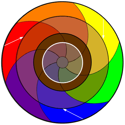
To assist you with assessing dominant hues and predicting colour outcomes I have created the colour wheel below based upon the Red, Yellow, Blue (RYB) colour model utilising only the primary and secondary colours, as discussed in our previous article even though the RYB colour model has a limited gamut and some of the prior claims about the model are now known to be inaccurate many artists still use the model because they believe it is simple and intuitive, however I have customised the standard RYB colour wheel specifically to illustrate some important concepts that are specific to our work in cosmetic tattooing.
Cosmetic Tattooist Customised RYB Colour Wheel

You will notice our customised colour wheel has 5 concentric circles of colour, each has been added as descriptor for a particular concept;
Circle 1: The outer circle displays a standard RYB colour wheel with the primaries Red, Yellow, Blue and the secondaries Orange, Green, Purple. The arrows indicate the complementary colour for each of the primary and secondary colours, you may recall from our previous article 'Warm vs. Cool' you should not confuse complementary (to make complete) with complimentary (flattering, looks good together), complementary colours together with their complement on the opposite side of the wheel will contain all three primaries of this colour models triad (Red, Yellow, Blue). For example purple contains Red and Blue its complementary colour is yellow so together they complement (complete) the triad by containing all three of the paint artists colour model primaries of Red, Yellow and Blue.
Circle 2: The next circle provides a colour illustration of how adding a small quantity of a complementary colour to each of the primary and secondary colours starts to cause a shift in the hue in the direction of a more brownish version of the original colour. This illustrates how the addition of a complementary colour can be used to colour correct an unwanted hue, e.g. an orange correction pigment or a brown that is dominant orange may be used to correct a tattoo that is blue or a brown that has blue dominance and cause a hue shift towards a more neutral brown. You can think of this as the first step away from the primary or secondary towards a more brownish hue.
Circle 3: This circle represents a neutral brown i.e. a brown that does not appear to have a dominance in any of the primary or secondary colours, a neutral brown may appear to be lighter or darker depending on the level of saturation (concentration) in the skin. With eyebrow tattooing sometimes the tattooist attempts to achieve a final hue of brown that has a very slight dominance in the direction of one of the primary or secondary colours to match the clients natural hair colour but more often than not we are attempting to create eyebrow tattoos that are neutral browns of varying concentrations and colour corrections are considered when the healed tattoo is a brown that has dominance in one of the primary or secondary colours e.g. red, green or blue are the more common unwanted dominances. A neutral brown is usually created when Red and Yellow are mixed together and a small amount of blue is added or alternatively a similar mixture from secondaries e.g. mixing shades of orange and some blue or green, plus or minus some yellow, and red.
Circle 4: This circle illustrates how the addition of white can cause colours to appear greyish, (this is particularly the case with mixtures of colours). Creamy white hues may be contributed to the tattoo colour by the clients natural skin colour (especially Fitzpatrick I-III) and or via the addition of titanium dioxide which is a white powder that is commonly added to cosmetic tattoo pigments to brighten the colour mix or to create a softer duskier hue.
Circle 5: A grey tattoo may be the result of incorrect choice of pigment for the clients skin colour, excessive or inappropriate mixing of pigments, changes to the tattoo colour as the pigment saturation reduces in the skin during fading or due to the pigment being implanted too deep in the skin (caused by the Tyndall Effect) resulting in a bland muddy grey colour.
Complementary Colour Mixing: The three graduated colour scales illustrate how mixing complementary colours tend to create shades of brown towards the middle of their mixing range.
The Colour Spiral
It is not uncommon to hear a cosmetic tattooist say that they mixed two or three pigments together and they cannot understand why the tattoo ended up healing a muddy brown or greyish colour, it is worth keeping in mind that in most circumstances cosmetic tattoo pigments are created from 2-3 or more colourant ingredients it is likely that none of them were primary or secondary colours they were probably mixtures of those colours, by mixing 2-3 pigments together you end up creating mixtures of 6-9 or more colourants. Every time that you mix colours together you step further away from the vibrant primaries and secondaries and spiral inwards towards muddy colours (browns) and if we add white to the mix we increase the risk of creating an unattractive grey.
Most pigment ranges will have a broad enough range of colours to meet your needs, if the pigments have been compounded by an experienced pigment chemist then they will have kept the number of colourant ingredients used in each pigment to a minimum to reduce the risk of creating muddy colours, they will have carefully selected which pigment mixes to add titanium dioxide (white) and they will have ensured that the lightfastness of each ingredient is comparable to ensure that they fade at the same rate.
When you mix pigments together you risk creating muddy brown or greyish results and you increase the chances that the tattoo will change colour as it fades due to differences in the lightfastness of the ingredients.
Question: Why does colour choice, colour mixing or colour correction sometimes produce unexpected results?
Answer: You can see from our 'Complementary Colour Mixing' graduated table above that the concentration of each colour additive has a marked effect on the final mix, we have deliberately limited the number of steps in each example to illustrate that creation of a neutral brown requires a precise mix of the right colour combinations, as mentioned above its fairly easy to create muddy brown colours with a dominant hue in one direction or another it is more challenging to hit the right combination for a neutral brown. For this reason for example when you are attempting to colour correct an eyebrow that is just a little bluish sometimes it is better to add a drop or two of orange colour corrector to a neutral brown pigment and slowly adjust the colour of the tattoo rather than using a concentrated orange and shifting the hue too far in the other direction, it is a case of using the right concentration of colour to adjust the degree of dominance of the unwanted colour.
Other factors that can influence the outcome from colour choice, colour mixing or colour correction are 'Relative Contrast' & 'Metamerism';
Relative Contrast
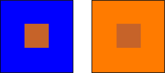
Paint Artists may sometimes refer to this as simultaneous contrast, a colour may appear to be different hue when compared to other colours, this phenomenon is particularly noticeable when complementary colours are involved. In the example below the centre square is the same colour in each of the larger squares but it may appear to be orange when compared to the primary colour blue or brown when compared to its orange complement. It is important for cosmetic tattooists to be aware of relative contrast because the dominant hue of your clients skin will affect the apparent colour of the tattoo pigment particularly if the dominant hue of the clients skin trends towards the complement of the dominant hue of the pigment (you might want to read this sentence again to fully grasp it).
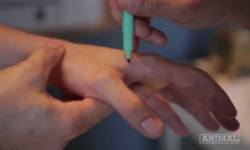
You may have seen it suggested that a pigment colour can be selected based upon a clients Fitzpatrick skin type but as mentioned previously a Fitzpatrick score is an indication of melanin saturation not the dominant hue, for this reason it is a good idea to always check the pigment colour against your clients skin before tattooing, a smear of pigment from thick to sparse over the back of clients hand and forehead will assist you to evaluate relative contrast before using the chosen pigment.
Metamerism
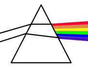
Metamerism is a topic that is rarely tackled in training programs because a first glance it appears to be extremely complicated, however it explains why mixing two or more colours together may sometimes produce unexpected colour results, to understand metamerism first we need to have a brief recap on how our perception of colours occurs in the first place. The visible light spectrum (white light) is composed of waves of light of different lengths, when wavelengths of white light are separated after passing through a prism our eyes are able to perceive those wavelengths with the range of approximately 390-700nm.
 |
625–700 nm Red
590–625 nm Orange
565–590 nm Yellow
520–565 nm Green
500–520 nm Cyan
440–500 nm Blue
420–440 nm Indigo
400–420 nm Violet |
|
When white light hits the surface of a physical object some portions of the visible spectrum may pass through (if translucent) some portions may be absorbed by the surface of the object and other portions will be reflected, the visible wavelengths that are reflected are what gives the object the apparent colour that we see, this is called a subtractive colour system because it is the subtracted wavelengths of light that result in the reflected colour of the object.

However there is a catch unlike a colorimeter or spectrophotometer our eyes do not actually have receptors that detect and measure each wavelength of light, our eyes have two types of photoreceptor cells called rods and cones, rods are extremely sensitive to light intensity but they only provide us a fairly low resolution greyish image, there are three types of cones that require higher light intensity to function at their best (brighter light conditions are required hence the reason why our discrimination of colour is lower at night) and each type of cone has a specific range in wavelength that they detect, the three types of cone have peak sensitivity around the Red, Green and Blue wavelengths, often called the tristimulus values. To enable us to enjoy the rich colour experience that we do we must rely upon a combined stimulation of the three types of cones in different combinations.
Therefore our perception of colour is dependent on;
Because of these limitations in our colour vision sometimes objects that reflect different wavelengths of visible light (different spectral distributions) can stimulate our eyes in exactly the same way, they are called 'metamers' meaning that we see them as the same colour even though they are actually reflecting different wavelengths of light. This phenomenon explains why sometimes combinations of coloured pigments produce combined colour outcomes that are different to what we might expect, as colours become brighter they have fewer metamers so ours eyes have better discrimination and less false colour matches, as colours become duller/whiter/greyish the number of potential metamers increases and more false colour matches will occur.
You will recall from our colour spiral diagram above that the more we mix pigment colours together the more it causes the final colour to spiral towards muddy browns and greys and due to the phenomenon of metamerism we also increase the number of false matches i.e. the more colours start to look the same muddy greyish hues. Hopefully this has discouraged you from mixing pigments together unless it is really necessary to achieve that 'special colour' for your client, as mentioned it is much better to select a premixed colour that was produced by your pigment chemist than to engage in colour mixing.
Question: Why do fine deposits of pigment sometimes heal to a greyish colour?
Answer: In our article
Why Do Cosmetic Tattoos Change Colour? - Part 2 on CTshop.com.au we described how the spectral characteristics of human skin results in scattering of light at a fairly shallow depth around 500µm, larger deposits may be more susceptible to the Tyndall effect and back scatter which we described as the Depth: Colour/Size effect i.e. the larger the pigment deposit is and the deeper it is in the skin the more likely the deposit will appear to be larger than its actual size and bluer/greyer than its actual colour.
However extremely fine deposits of pigment as are now being used for fine hair like strokes with micro needles and MicroBlading may be susceptible to swamping with scattered/polarised light, as light travels through a translucent medium such as epidermal skin it can cause the electrons of the atoms to vibrate which in turn can cause light to scatter, scatter involves the absorption of light and then the reemission in a variety of directions and shorter wavelength higher energy light (e.g. blue light around 440-500nm) is more susceptible to scatter and partial polarisation, this phenomenon of light scattering is part of the reason for the blueness of our skies.
Extremely fine deposits of brown pigment in the skin may be susceptible to swamping by scattered blue light from surrounding skin, or in other words with such a small reflectance surface on the pigment of hair like stroke the red/orange/yellow wave lengths that are reflected are swamped by adjacent blue light scatter. Consequently you may need to use a pigment that is a little more dominant in the complementary side of the colour wheel to compensate i.e. Red/Orange/Yellow.
References
- Klaus Wolff, Richard Allen Johnson, Arturo P. Saavedra. Fitzpatricks Color Atlas and Synopsis of Clinical Dermatology, Seventh Edition March 27, 2013
- Charles Hayter. An Introduction to Perspective. 1813
- Betty Edwards. A course in the Art of Mixing Colors. Penguin Group 2004
- Birch J1.Worldwide prevalence of red-green color deficiency. J Opt Soc Am A Opt Image Sci Vis. 2012 Mar 1;29(3):313-20.
- F. Solano. Melanins: Skin Pigments and Much More—Types, Structural Models, Biological Functions, and Formation Routes. New Journal of Science Volume 2014
- Alwin Kienle, Lothar Lilge, I. Alex Vitkin, Michael S. Patterson, Brian C. Wilson, Raimund Hibst, and Rudolf Steiner. Why do veins appear blue? APPLIED OPTICS 1 March 1996 @ Vol. 35, No. 7
- Color for Science, Art and Technology edited by K. Nassau 1998 | ISBN-10: 0444898468
Date of most recent revision: 18/08/2015 (mutatis mutandis)
Original publication date:
28/05/2015
Copyright © 2015
CTshop.com.au & the article author All Rights Reserved. No copying, transmission or reproduction of site content is permitted without our prior written consent.
Disclaimer: The content of this article should be regarded as general information & is provided solely for the purpose of discussion & is not intended to replace cosmetic tattoo training or medical advice in any instance, always check with a cosmetic tattoo master trainer and or a qualified medical practitioner before acting on any information regarding cosmetic tattooing or in relation to any medical condition or medical circumstance.
Printing Restriction: This article is print disabled, please read our Intellectual Property & Copyright Policies if you would like to request a copy or permission to use the article content for any purpose.

|